Martin Stranka |
My Impressions |
|
|
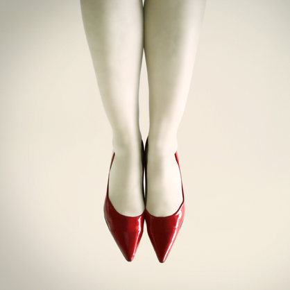
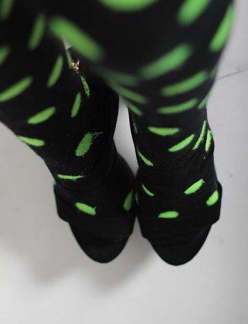
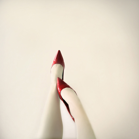
The image on the left is Martin Stranka's work and the one on the right is my impression on that image. I have rotated my image so that i is the same way around to the one on the left. I have also cropped my image so that it is the most appropriate size, similar to the one on the left. I have done all my editing on the picmonkey.com website. The difference between the two images is that the one on the left has just red shoes, whereas my image has black high heels and funky, knee high socks. This is my personal twist on the original image as I thought the original image looked a bit plain and uninteresting.
|
|
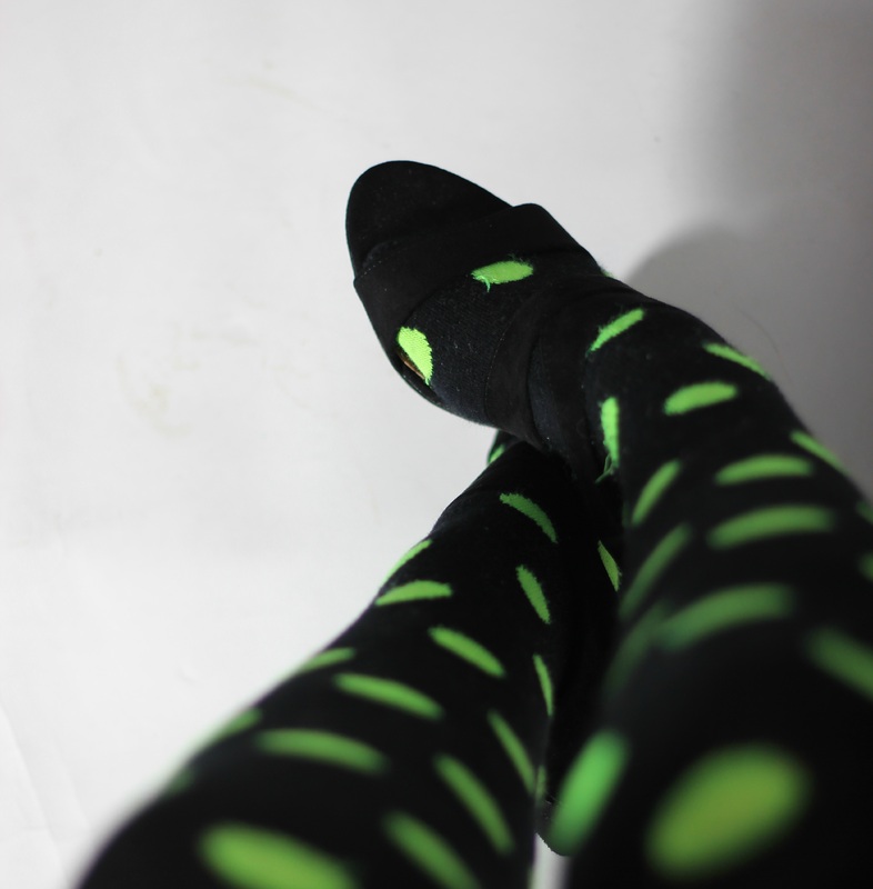
Again, the image on the left is Martin Stranka's and the image on the right is my impression of that image. I have cropped my image to get it to the most appropriate size and also to make it look as much like the one on the left as possible. I have also rotated the image to the same direction as the image on the left. I have done all the editing on the picmonkey.com website. The only difference between the two images is that the one on the left has just red shoes, whereas, in my image the model has black high heels on and funky, knee high, socks. This was my own personal twist on the original image because I thought that the original looked a bit plain with just the red.
|
|
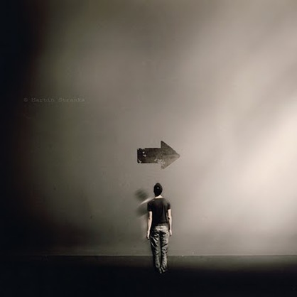
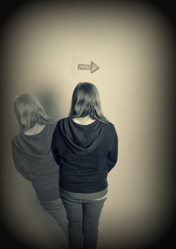
Again, the image on the left is Martin Sranka's work and the image on the right is my impression of that image. I changed my image from colour to "Cross Process" using the effects. I also added the "Dark Edges" frame effect to darken the edges like the image on the left. I did this part of my editing on the picmonkey.com website. I then opened the image onto Adobe Photoshop and created the second layer which is the clear person on the left of the person. This was to make it look more like the image on the left. The difference between the two images is that my image is more zoomed in compared to the one on the left. And I also used a female model and the one on the left used a male model.
